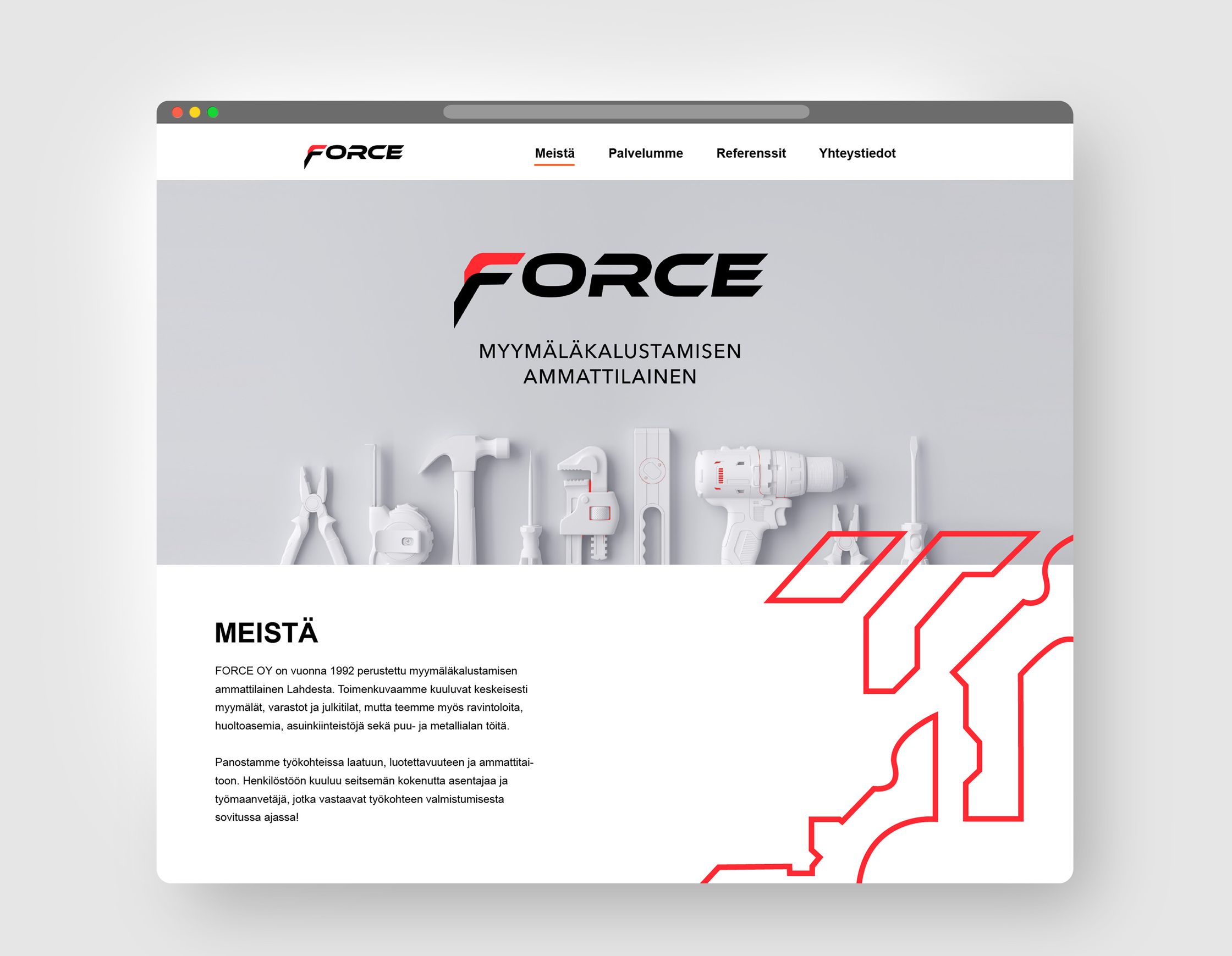
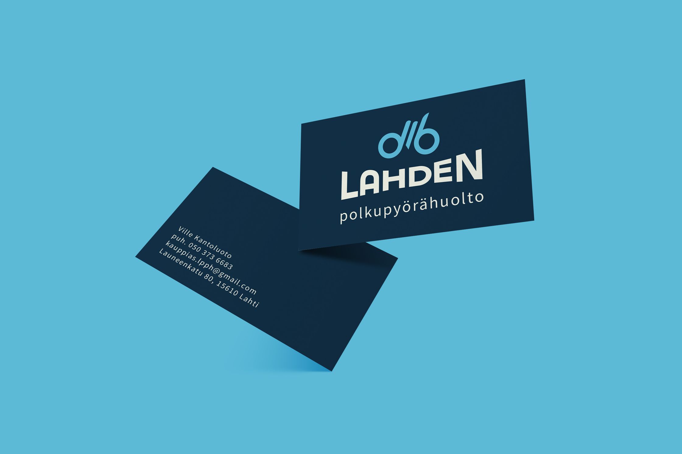
Force - Visual Identity
This is a rebranding proposal for the Finnish shop furnishing company Force. They decided to modernize the visual identity after the company got a new owner.
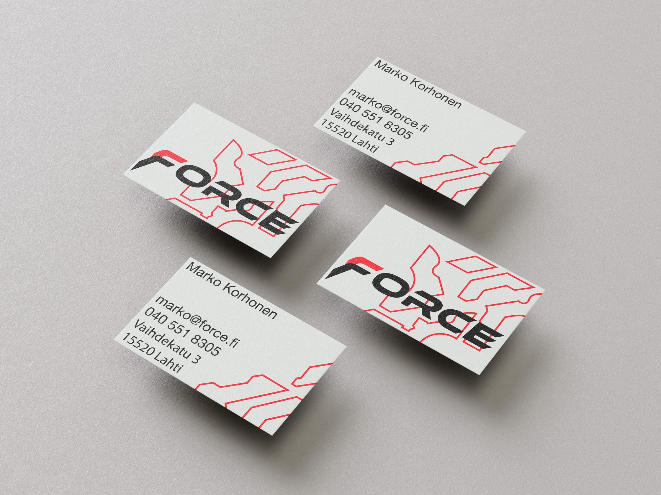
The keywords for this project were modern, strong and professional. Also, the new owner wanted to keep the colors red, black, and grey, which they had in the previous logo.
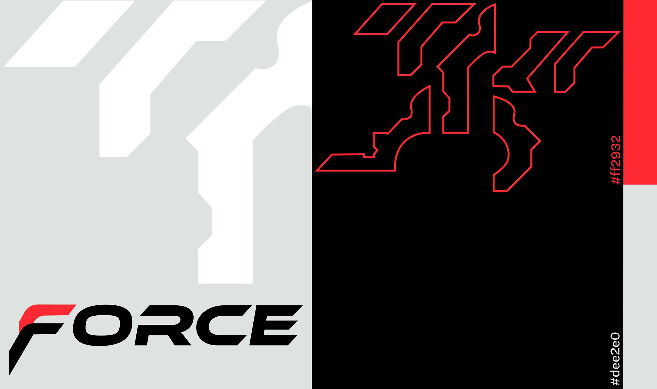
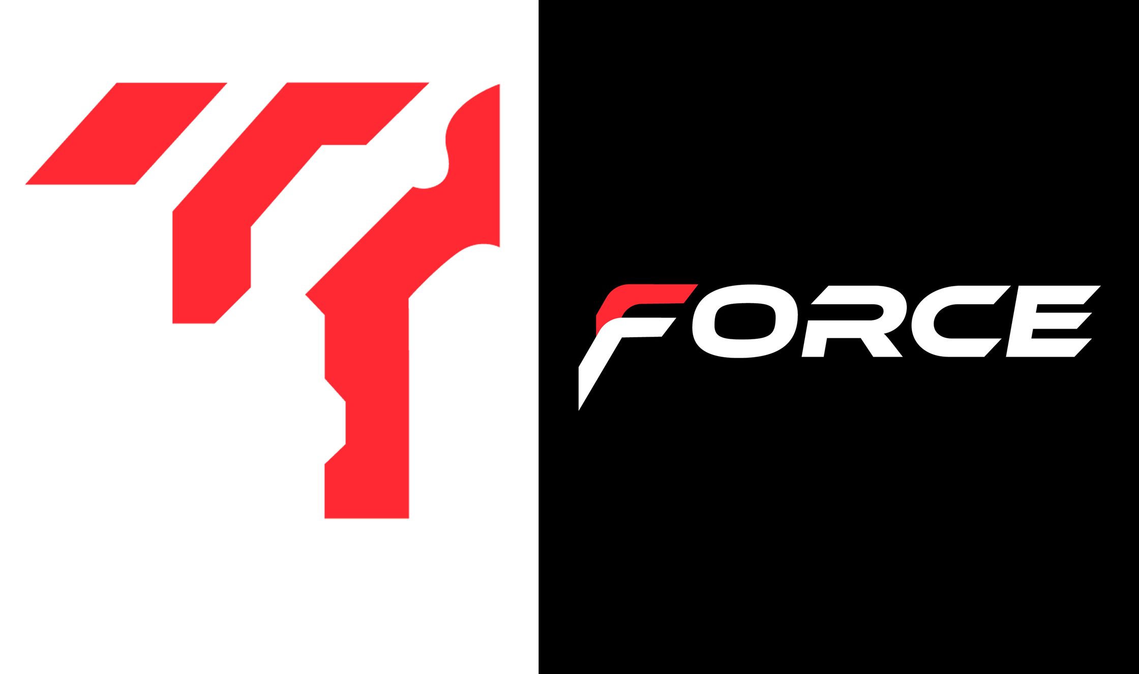
I made the logo typographic and simple yet dynamic. Graphic elements I created to be used pattern-like in other materials such as car taping to make the look more recognizable. This allows them to be used more flexibly depending on the materials they will be used on.
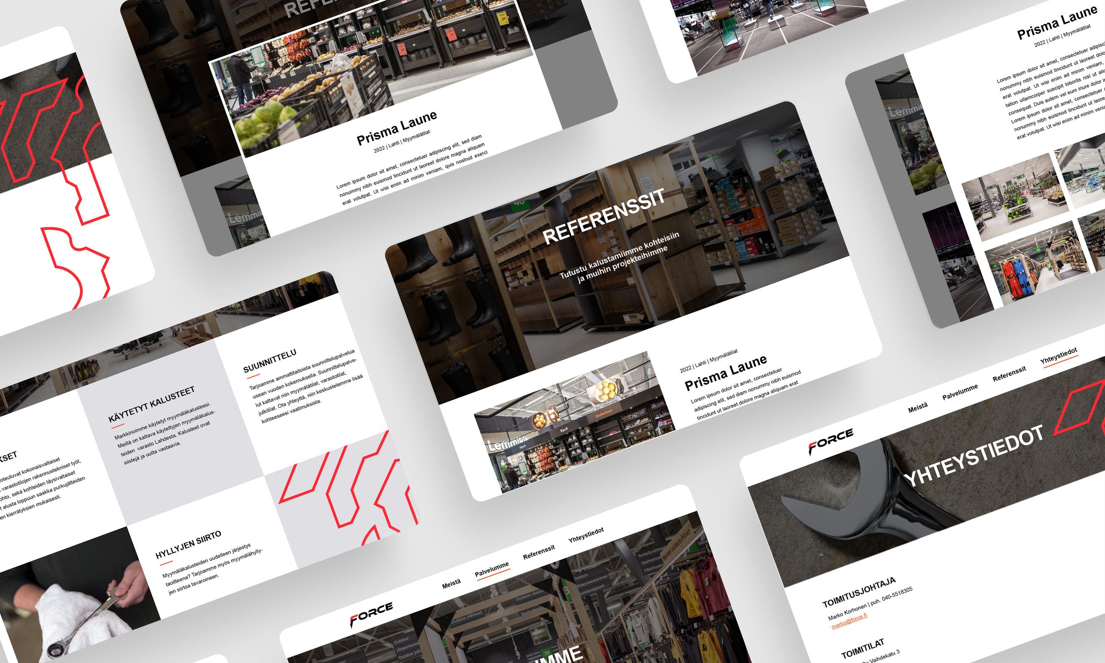
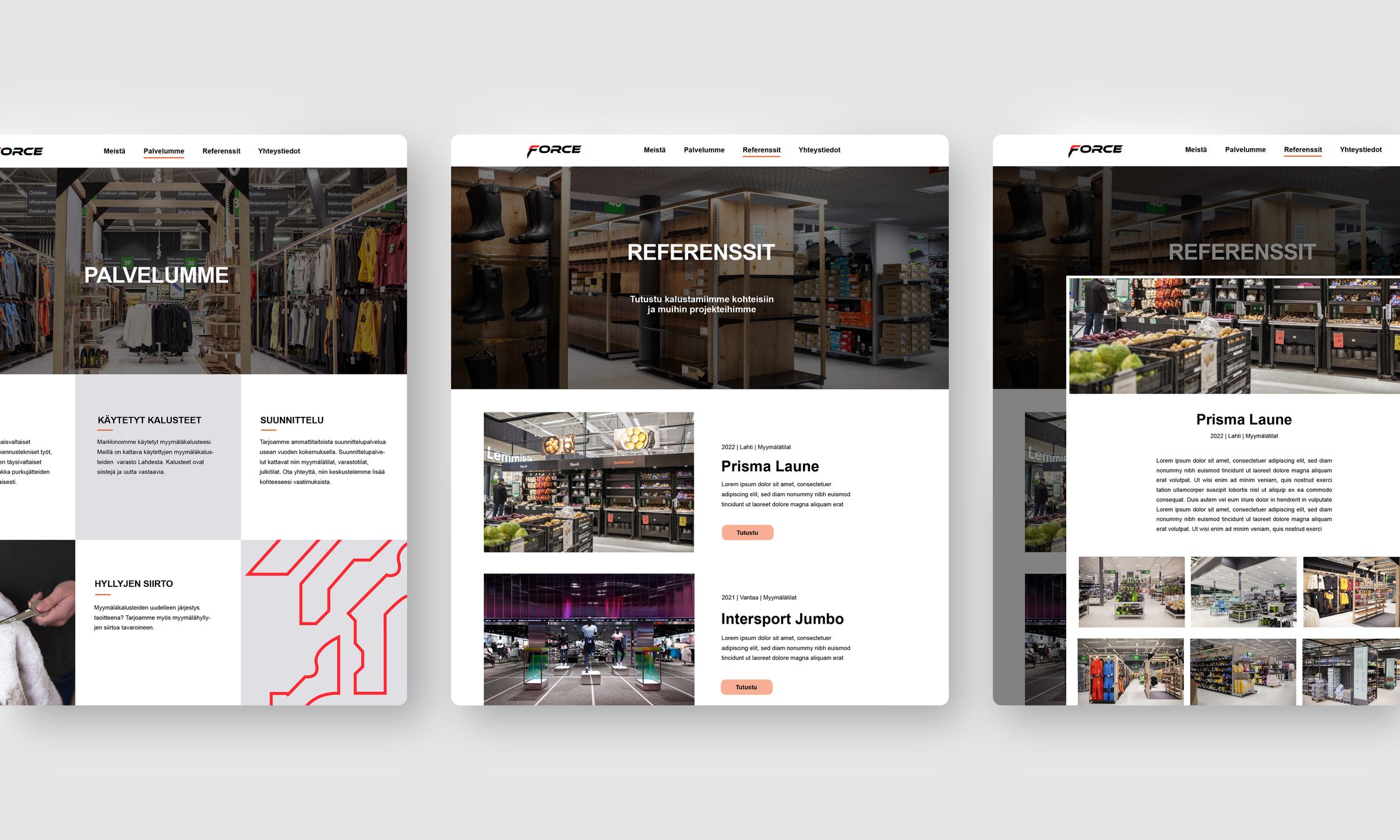
In addition, I was asked to produce website layouts that could possibly be used as guidelines by the company that will keep maintaining its website in the future. The company's website is on WordPress so I used an existing layout as a base for my work so that the updating would be smoother and easier when it’s done.
To see more click on the sides.
2022